Halcyon State of Mind: A Brand Identity
We refreshed key elements of our brand identity to create a unique and consistent design language, representing the name and meaning of Halcyon, and what the brand stands for. We refined our color palette and gradients, and refined our approach to layout and design. There's also custom set of icons, too!
Let this page be your online guide with resources to aid you in bringing the Halcyon brand to life. Check back for updates!
Compare Quartiles
Select Quartiles to compare each RaaS groups across quarters.
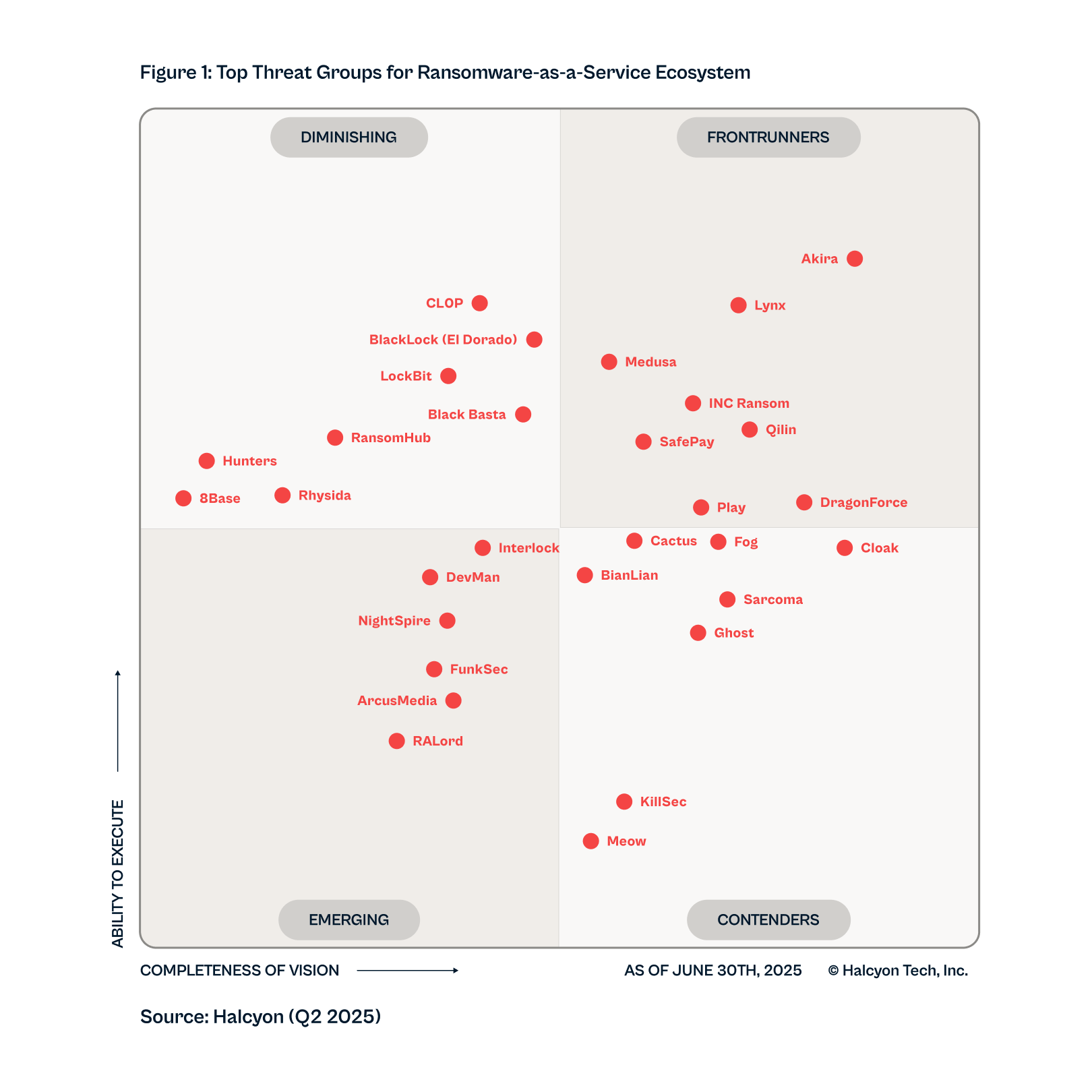
Q2-2025

Q1-2025

Q4-2024
.png)
Q3-2024

Q2-2024
.webp)
Q1-2024

Q2-2023

Q3-2023

Q4-2023

Q1-2023
Q2-2025
Q1-2025
Q4-2024
Q3-2024
Q2-2024
Q1-2024
Q2-2023
Q3-2023
Q4-2023
Q1-2023

Primary Brand Logo
The Halcyon wordmark is designed to be timeless, intelligent, and nostalgic. Never use the wordmark without the logomark, although at small sizes, you can use the logomark alone.
Primary logo
Secondary Logo Applications
Gradient + Charcoal
Flat + Charcoal
Mono - Charcoal
Mono - Dark Navy
Gradient + White
Flat + White
Mono - White
Gradient + Charcoal
Flat + Charcoal
Mono - Charcoal
Mono - Dark Navy
Gradient + White
Flat + White
Mono - White
Color Palette
Stick to the primary color palette in order to create consistency throughout brand interactions, and use the secondary color palette sparingly to enhance and support the primary colors. Our brand also includes both linear and freeform 'mesh' gradients for backgrounds.
Typography + Pairings
Primary Headline
Secondary Headline + Body
Halcyon Icons
Our icons are designed using a specific pixel grid and stroke weight. Please don't simply 'create your own' ad hoc, and ensure the icons only ever appear in primary brand colors. All icons must be considered, and approved before being added to the Halcyon icon library.
See Halcyon in Action

Threats like ransomware are designed to evade modern security tools, and just one miss can have a catastrophic impact on your organization.